|
|
|
It’s no coincidence that magazine designer Rudy Vanderlans
and type designer Zuzana Licko founded Emigre Inc. the same year the Macintosh debuted.
Emigre embraced both the capabilities and constraints of the Mac,
consistently creating innovative and influential works.

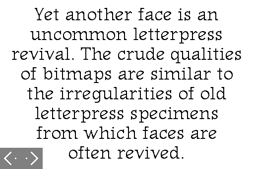
For years, Emigre sampled the low-res world of the Mac screen for use in hi-res print. When Zuzana Licko delved into HyperCard to make a font catalog, these techniques could be used without a hint of irony.
First released in 1989, ‘Signs of Type’ fit on a diskette, and was distributed by mail and BBS.

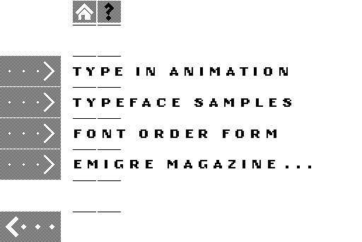
Choosing ‘Type in Animation’ from the menu launches a
section that is educational and entertaining. Properties of digital typography
are explained that help appreciate ideas being explored in Emigre Fonts.
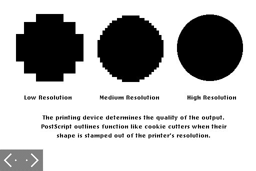
Difficult concepts are communicated with precise language, simple graphics and economical animations.
Like most great type catalogs, ‘Signs of Type’ was an exquisite object of desire for designers. Unlike earlier catalogs, it could be (and was) copied and shared among colleagues.
In the fall of 1989, our design studio was still new.
We mostly worked for more established studios, cutting our teeth on their mechanical work,
and helping them adapt to the digital world.
We were trying to imagine creative, cheap ways to attract more of this business.
One day, a favourite client
phoned to say he had to come over, right then, and give us a disk with a program
on it we needed to see.
“You guys should do something like this,” Andy said, as he handed us ‘Signs of Type’.
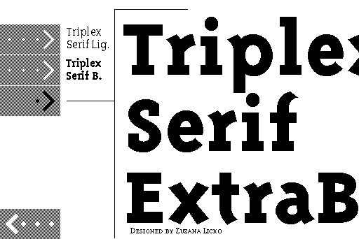
 It is successful as a type catalog. Of course, many Emigre faces hold up well in this format, because they
were designed with low resolution in mind.
It is successful as a type catalog. Of course, many Emigre faces hold up well in this format, because they
were designed with low resolution in mind.
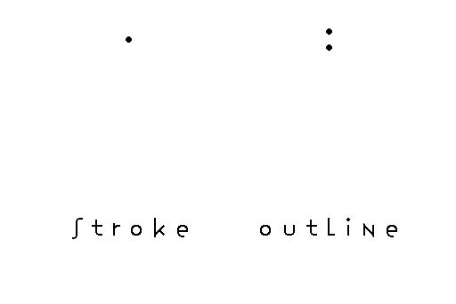
 Stroke and outline explained in animation:
 Zuzana Licko was already committed to her first love, typography,
when she explored HyperCard and created a touchstone hypermedia artifact.
Here at Smackerel we consider her an unheralded pioneer of new media.
Zuzana Licko was already committed to her first love, typography,
when she explored HyperCard and created a touchstone hypermedia artifact.
Here at Smackerel we consider her an unheralded pioneer of new media.